![Bluestone_PIM_white_logo_RBB-3.png]](https://help.bluestonepim.com/hs-fs/hubfs/Bluestone_PIM_white_logo_RBB-3.png?height=50&name=Bluestone_PIM_white_logo_RBB-3.png)
The Attribute type specifies the expected input into the attribute field, like for example a decimal number, date or text. Each attribute type has a different setup.
The following sections present details about each attribute type including an example input value.
Boolean Column Date Date and time Decimal Dictionary
Formatted Text Integer Matrix MultiSelect Multiline Regular Expression
Single Select Compound Text Time
Boolean
Accepts either Yes or No.
| Example input: | 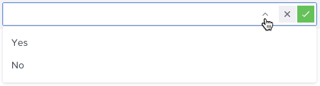 |
| Example value: | 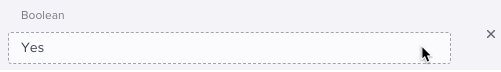 |
Column
This attribute type enables multi-column data entry, where the number of columns is fixed during configuration.
Caution: This attribute type has limited functionality and should be used sparingly. These limitations encompass core areas such as import/export workflows, filtering, advanced queries, and bulk editing. We strongly recommend exploring alternative data structures before committing to this type.
| Setup : | 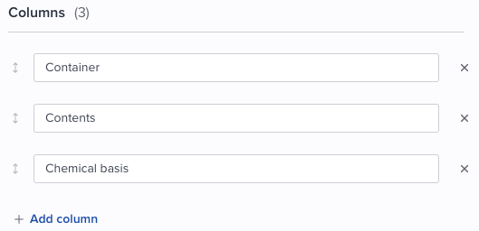 |
| Example input: | 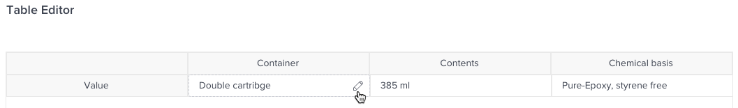 |
Compound
Represents a combination of multiple attribute values including any hard-coded texts. The attribute value as presented for a product is not editable.
Note that Multi-select, Dictionary, Matrix and Column types are not supported as part of the compound attribute.
| Setup: | 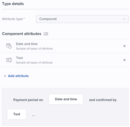 |
| Example input: |
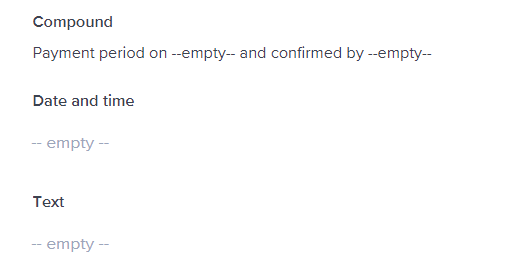
Compound attribute presentation when there are no values specified for the input attribute values:
|
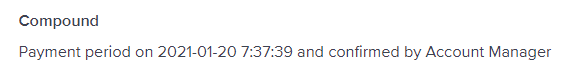
| Example value: |
|
Date
Represents a date that can be selected using the built-in calendar.
| Example input: | 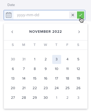 |
| Example value: | 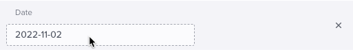 |
Date and time
Represents a date and time that can be selected using the built-in calendar and clock.
| Example input: | 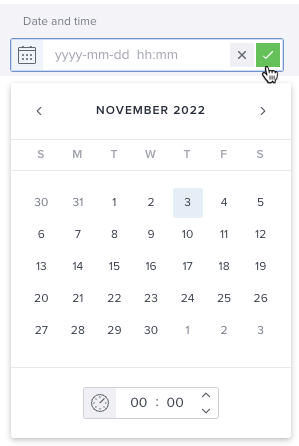 |
| Example value: | 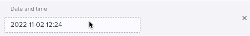 |
Decimal
Accepts numbers with decimals. Its allowed range can also be specified.
| Setup: | 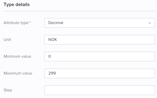 |
| Example input: | 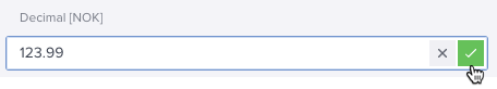 |
| Example value: | 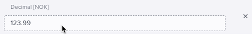 |
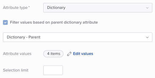
Dictionary
A multiselect attribute type used when having a major set of values.
It also supports a parent/child setup where you can limit/filter the available options for a child attribute based on values selected from a parent dictionary attribute.
| Setup : |
Parent dictionary attribute
|
|
For an attribute where you want to limit the available options based on the value selected for a parent dictionary attribute, select 'Filter values based on parent dictionary attribute'.
|
|
| Define values: |
Parent attribute The parent attribute values are defined in a normal manner. These values can optionally be used as filter for a child dictionary attribute. Click the plus icon in the upper right corner to add a value:
Specify the Name, and optionally a Number for each value. Click Done when all values are defined.
|
|
For a child attribute you need to select which values that should be available for the user based on which value the user has selected for the parent attribute:
Specify the Name, and optionally a Number for each value. Then select the relevant parent attribute value(s) from the Filters column. Click Done when all values and filters are defined.
|
|
| Example input: |
Parent attribute User selects the following value on parent level:
|
|
User can select from the following values on child level based on the selected parent attribute value:
|


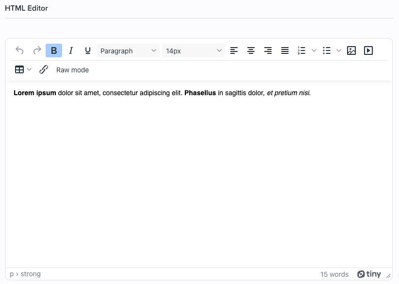
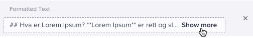
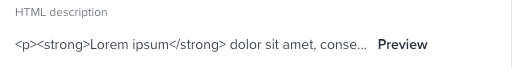
Formatted text
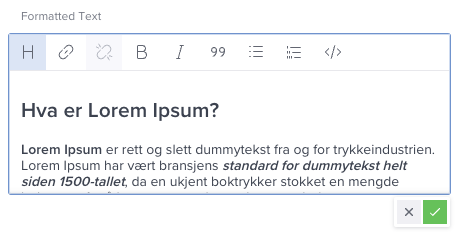
A type containing formatted text, allows for more customization of the text, like setting bold, italic, and headings styles. The formatted text uses Markdown or HTML.
| Setup: | Markdown or HTML |
| Example input: |
Content-type: Markdown
Content-type: HTML
|
| Example value: |
Content-type: Markdown Content-type: HTML |
Integer
A numerical attribute type that accepts only whole numbers. You can also define a specific minimum and maximum range for the input.
| Setup: | 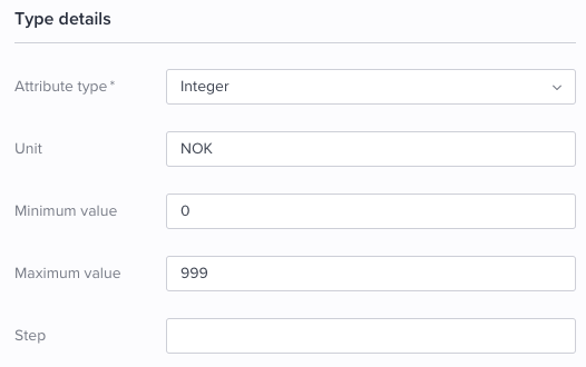 |
| Example input: | 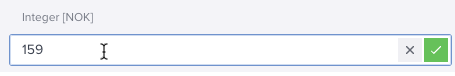 |
| Example value: | 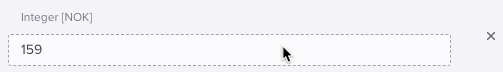 |
Matrix
A data type that provides a grid-based editor, allowing users to define specific values across multiple rows and columns for a single attribute.
Caution: This attribute type has limited functionality and should be used sparingly. These limitations encompass core areas such as import/export workflows, filtering, advanced queries, and bulk editing. We strongly recommend exploring alternative data structures before committing to this type.
| Setup : | 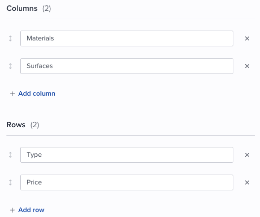 |
| Example value: | 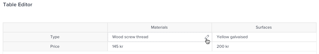 |
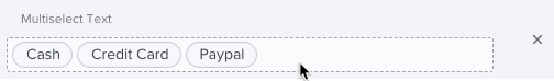
Multi-select
Provides several value options to the user, where one/more options can be selected. 'Text' or 'Color' can be selected as value type.
| Setup: |
Multi-select, Text:
|
|
Multi-select, Color:
|
|
| Example value: |
Multi-select, Text
Multi-select, Color
|


Multiline
Accepts several lines of text and is preferred used for longer texts without any need for formatting. The output text is concatenated.
| Example input: | 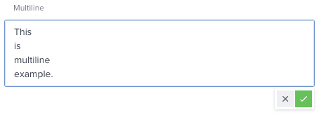 |
| Example value: | 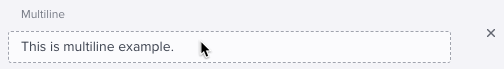 |
Regular expression
Useful when the input is required to be in a predefined format (pattern). The specified Expression will define the rules for allowed input. Please refer to Regular Expression Language - Quick Reference for details.
| Setup: | 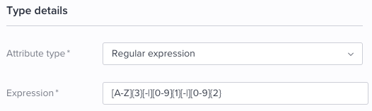 |
| Example input: | 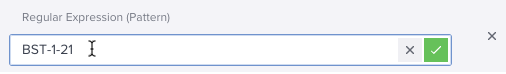 |
| Example value: | 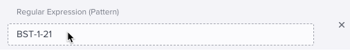 |
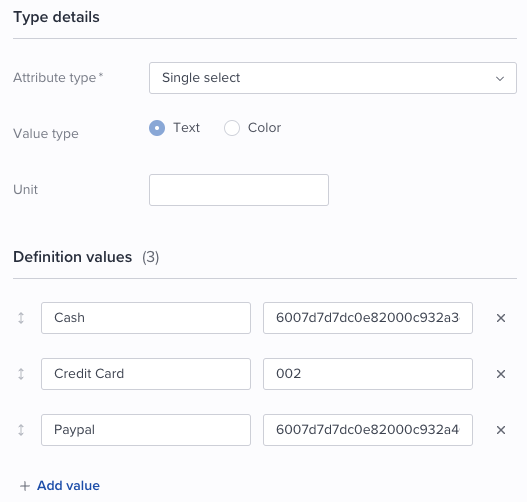
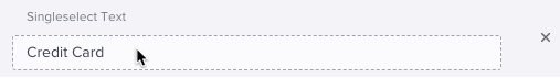
Single select
Provides several value options to the user, where only one option can be selected. 'Text' or 'Color' can be selected as value type.
| Setup: |
Single select, Text:
|
|
Single select, Color:
|
|
| Example input: |
Single select, Text:
|
|
Single select, Color:
|
|
| Example value: |
Single select, Text:
Single select, Color:
|


Text
A type containing basic text. Through the associated options, it is possible to limit the text length, and choose to allow white spaces
| Setup: | 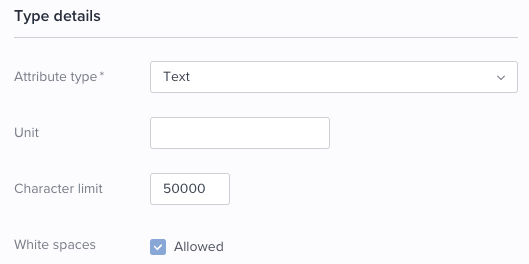 |
| Example input: | 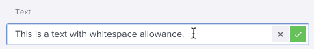 |
| Example value: | 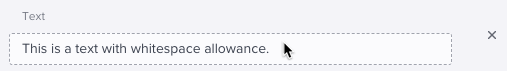 |
Time
A time type which can be set through the provided clock.
| Example input: | 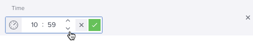 |
| Example value: | 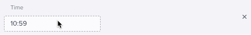 |